‘Dimensionality reduction’ is an important pre-processing step in ML. It aims to simplify the data by reducing the number of random variables under consideration, aiming to retain as much of the significant information as possible, but no more.
This technique is essential for managing the “curse of dimensionality,” a problem that arises as the number of features (or dimensions) in a dataset increases. This can lead to exponential growth in computational complexity and data sparsity, which can significantly hinder the performance of ML models.
88.2 What is dimensionality reduction?
Imagine you’ve got a bunch of photos of your favorite band playing at a concert from different angles, and you’re trying to sort them out. Each photo has a lot of details – colours, the band members, the instruments, and so on.
In machine learning, these details are like dimensions. If you’ve got hundreds of these details for thousands of photos, it would be tough to sort through, or compare, them, efficiently.
Dimensionality reduction is like summarising each photo with just a couple of keydetails that capture the most important elements.
For example, instead of noting every single detail, you might just focus on the identity of the individual and the main colour theme of the photo. This way, you can quickly get the ‘gist’ of each photo without getting bogged down by every little detail. Bono, black, Edge, gray, Larry, blue etc….
In machine learning, we do something similar with data. We reduce the number of details (dimensions) we’re looking at, so we can process and understand the data more easily.
By identifying and removing irrelevant and redundant features, dimensionality reduction improves model accuracy, enhances computational efficiency, and helps in visualising high-dimensional data in a lower-dimensional space.
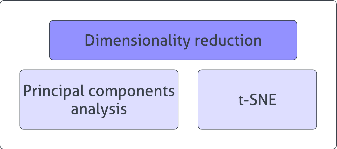
88.3 Techniques - Introduction
Common techniques for this include Principal Component Analysis (PCA), which linearly transforms features into a lower-dimensional space, and t-Distributed Stochastic Neighbor Embedding (t-SNE), a non-linear approach more suited to the visual exploration of high-dimensional datasets.
88.4 Principal Component Analysis (PCA)
Introduction
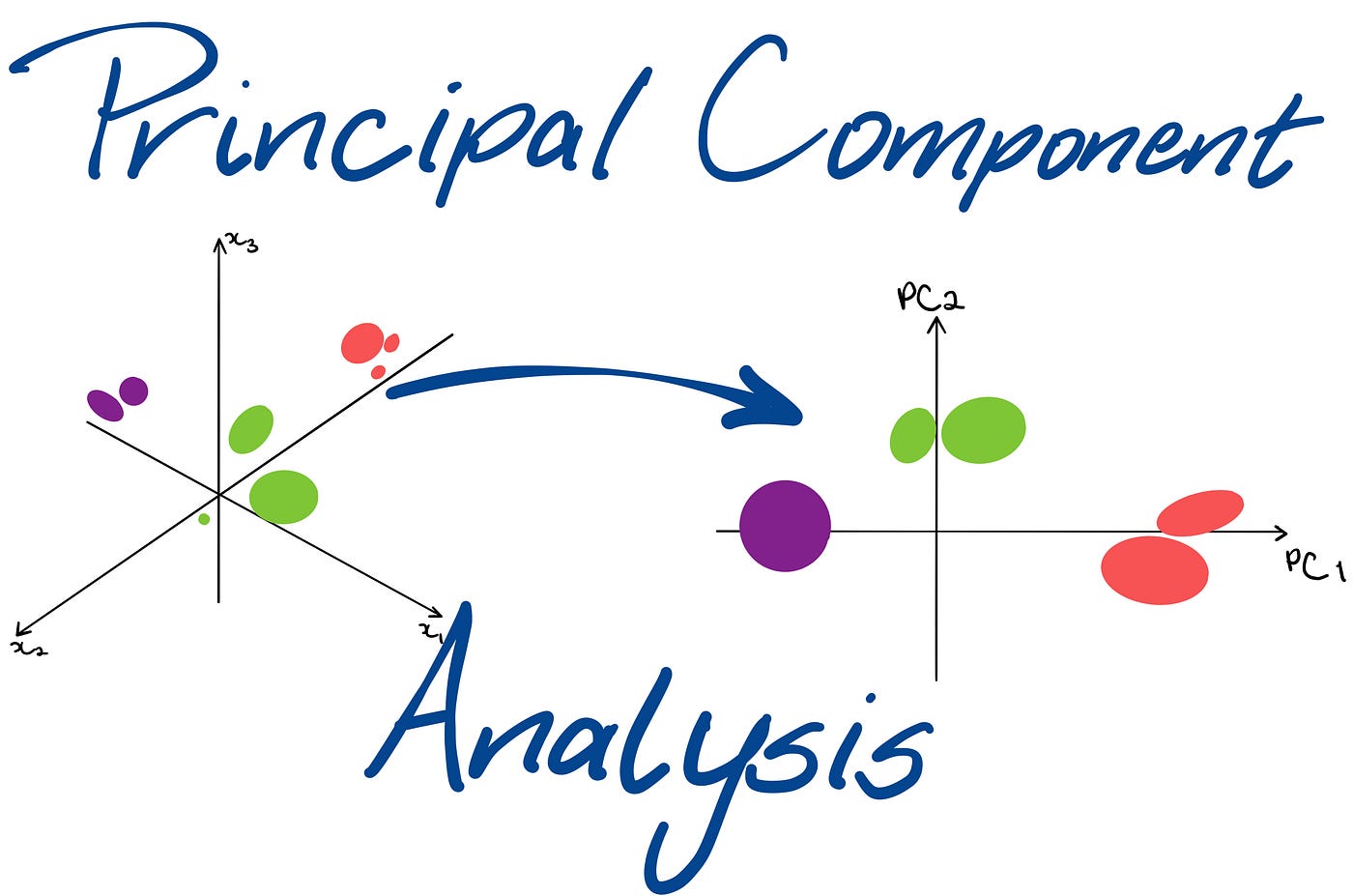
Principal Component Analysis (PCA) transforms high-dimensional data into a lower-dimensional form, ensuring that the newly-created variables capture the maximum possible variance from the original data.
By identifying the principalcomponents, which are the directions of maximum variance in the data, PCA provides a powerful way to analyse and visualise the structure of complex datasets.
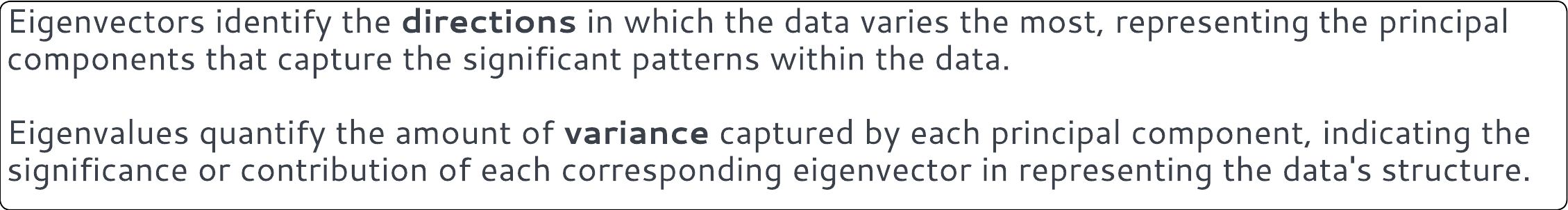
The process involves computing the ‘eigenvectors’ and ‘eigenvalues’ of the data’s covariance matrix, which then serve as the principal components.
These components are orthogonal, ensuring that the reduced dimensions are uncorrelated, and are ordered so that the first few retain most of the variation present in all of the original variables.
Confused?
Again, imagine you have a bunch of photos, and you want to organise them in a photo album. But your album has only a few pages, and you can’t fit all the photos. To solve this, you decide to summarise the photos in a way that the most important parts of them are shown on fewer pages.
In this analogy, think of your photos as data. The process of organising them is done using Principal Component Analysis (PCA). It helps us take a large set of data (like many photos) and summarise it into a smaller set that still tells us a lot about the original data.
For example, you might select one photo that represents bono-black, ignoring all the other photos that are really just variations of these two dimensions.
Eigenvectors and eigenvalues are like ‘helpers’ in this process. Imagine you have a magic wand (eigenvector) that points out what’s important in your photos. The strength of the magic (eigenvalue) tells you how much of the important stuff is captured by the wand’s direction. By using these wands in the best way, you get a few summary photos (principal components) that still show you the main ‘story’ of all your original photos.
These summary photos are lined up in an album (your reduced data) so that the most important photo is on the first page, the next important one is on the second page, and so on. This way, even if you only look at the first few pages, you get a good idea of what’s in the whole album.
And just like photos on different pages don’t overlap, these summary photos (or components) are made to be unique and not repeat what’s already shown, making each one of them special and informative.
PCA is particularly beneficial when dealing with multicollinearity, or when the number of predictors in your dataset exceeds the number of observations.
In summary, it simplifies the complexity of high-dimensional data, improves the interpretability of your results, and can enhance the performance of subsequent predictive models by eliminating redundant features.
What’s the difference between PCA and factor analysis?
Factor analysis and principal component analysis (PCA) are both techniques used for dimensionality reduction, but they differ in their goals and methods.
PCA aims to maximise variance and transforms original variables into orthogonal (uncorrelated) principal components without considering any underlying latent structure.
In contrast, factor analysis seeks to identify latent factors that explain observed correlations among variables, assuming that the observed variables are linear combinations of the underlying factors plus some error.
Example
Create a dataset:
show code for dataset creation
rm(list=ls())library(ggplot2)# Create synthetic dataset with more dimensionsset.seed(123)V1 <-rnorm(100, mean =50, sd =10)V2 <- V1 +rnorm(100, mean =0, sd =5) # Correlated with V1V3 <- V1 -rnorm(100, mean =0, sd =5) # Correlated with V1V4 <-rnorm(100, mean =20, sd =5) # Not correlated with V1V5 <- V4 +rnorm(100, mean =0, sd =2) # Correlated with V4V6 <- V4 -rnorm(100, mean =0, sd =2) # Correlated with V4V7 <-rnorm(100, mean =-10, sd =5) # IndependentV8 <-rnorm(100, mean =5, sd =3) # IndependentV9 <- V2 *rnorm(100, mean =1, sd =0.1) + V6 # Composite, correlated with V2 and V6V10 <-rnorm(100, mean =0, sd =4) # Independentdata <-data.frame(V1, V2, V3, V4, V5, V6, V7, V8, V9, V10)
# Perform PCA on that datasetpca_result <-prcomp(data, scale. =TRUE)# Print the summary to see the proportion of variance explained by each principal componentprint(summary(pca_result))
The summary will give you the importance of each of the eight principal components, showing how much variance each principal component ‘captures’ from the data.
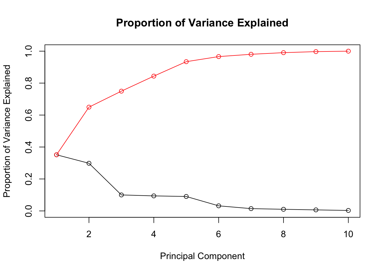
note that the ‘proportion of variance’ for PC1 is highest, and it decreases for each subsequent component. note also that the ‘cumulative proportion’ increases until it reaches 100% with PC10.
Usually, we look at the Proportion of Variance to decide how many principal components to keep. The goal is to reduce the dimensionality while retaining most of the information (variance).
in the example above, you can see that the proportion of variance increases sharply between PC1 and PC2, and then starts to ‘plateau’ for the remainder.
We can visualise the first two principal components:
Code
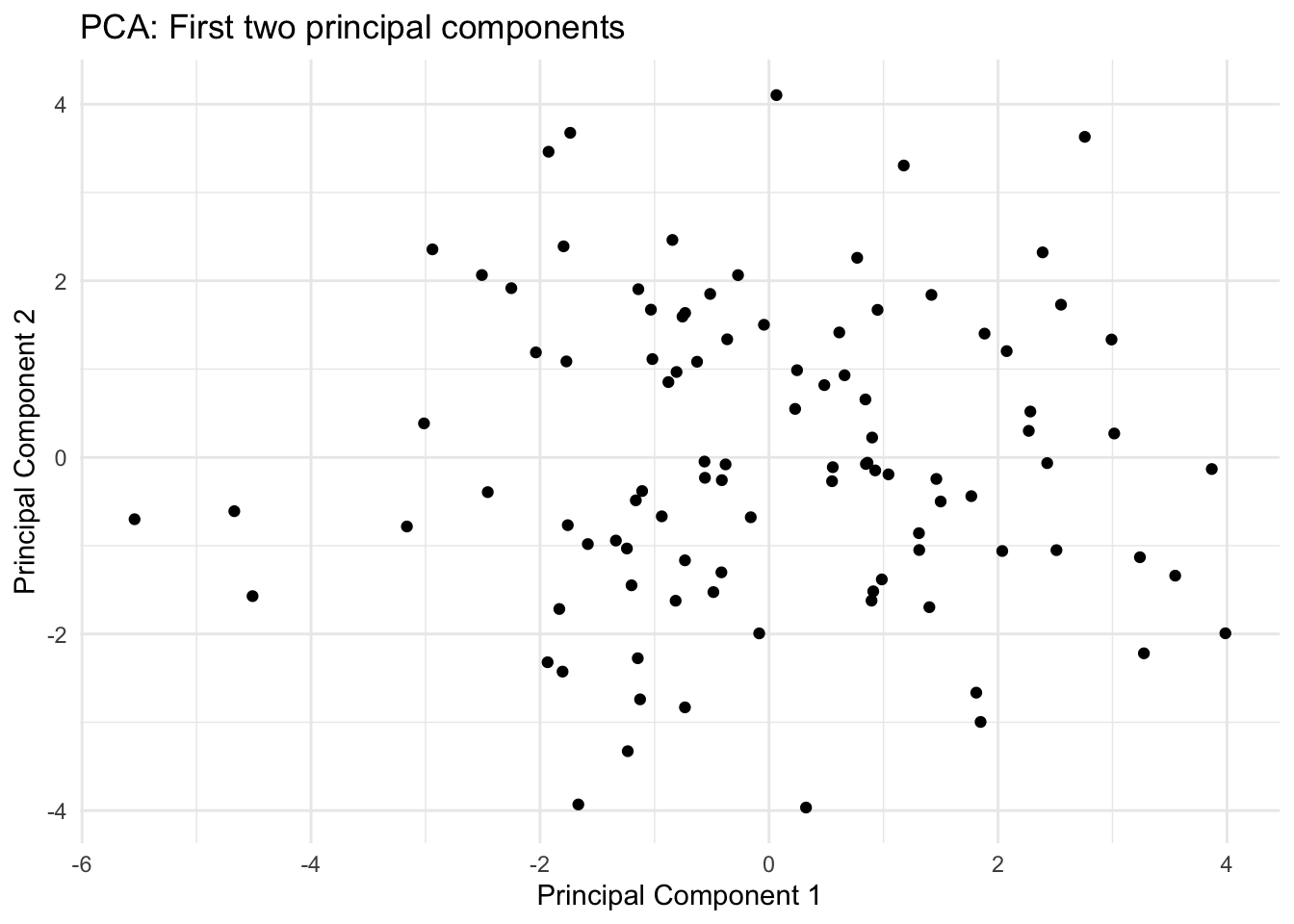
library(ggplot2)# Create a data frame of the PCA scorespca_scores <-as.data.frame(pca_result$x)# Plot the first two principal componentsggplot(pca_scores, aes(x = PC1, y = PC2)) +geom_point() +xlab("Principal Component 1") +ylab("Principal Component 2") +ggtitle("PCA: First two principal components") +theme_minimal()
This shows the observations projected onto the first two principal components. It often reveals clustering patterns that weren’t apparent in the high-dimensional space and is a good way to visualise the ‘essence’ of your data in two dimensions.
Remember, PCA is best used when you have linear relationships and numerical data, and it’s crucial to interpret the principal components based on your specific context and data.
How do we decide how many dimensions to retain?
Variance Explained Criterion
Often, we will choose to retain the number of components that together explain a substantial amount of the variance (e.g., 70%, 80%, 90%).
You can determine this from the cumulative variance explained by the principal components. The summary function in R, when applied to the PCA result, shows the proportion of variance explained by each component and cumulatively.
Code
# Print the summary of PCA results to see the proportion of variance explained by each componentprint(summary(pca_result))
# Plot the cumulative proportion of variance explainedplot(pca_result$sdev^2/sum(pca_result$sdev^2), type ='o', main ="Proportion of Variance Explained", xlab ="Principal Component", ylab ="Proportion of Variance Explained", ylim =c(0, 1))cumulative_variance <-cumsum(pca_result$sdev^2) /sum(pca_result$sdev^2)points(cumulative_variance, type ='o', col ="red")
Scree Plot
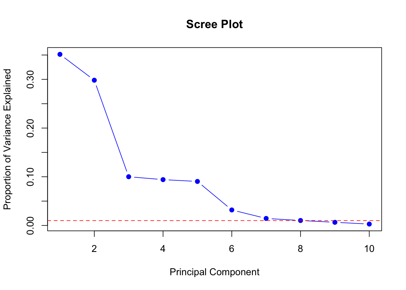
A scree plot shows the eigenvalues or the proportion of variance explained by each principal component in a descending order.
we have already used this technique when learning how many clusters to retain in k-means or hierarchical cluster analysis.
Typically, you look for a point where the slope of the curve sharply changes, known as the “elbow point.” The components before this point are retained as they represent the most significant structure of the data.
Code
summary_pca <-summary(pca_result)# importance matrix holds the variance explained valuesvar_explained <- summary_pca$importance[2,] # Proportion of Variance Explained# Create scree plotplot(var_explained, xlab ="Principal Component", ylab ="Proportion of Variance Explained",type ='b', pch =19, col ="blue", main ="Scree Plot")abline(h =0.01, col ="red", lty =2) # Optional: Line to indicate cutoff for smaller eigenvalues
Kaiser Criterion
The principle with the Kaiser criterion is to retain all components with eigenvalues greater than 1. This rule is based on the idea that a principal component should explain more variance than a single original variable.
Code
# The eigenvalues can be obtained by squaring the singular values (standard deviations in pca_result)eigenvalues <- pca_result$sdev^2# Apply Kaiser criterionnum_components_kaiser <-sum(eigenvalues >1)cat("Number of components to retain according to Kaiser criterion:", num_components_kaiser, "\n")
Number of components to retain according to Kaiser criterion: 3
Conclusion
Hopefully, you now understand the basic idea of PCA, which is to reduce a dataset with a high number of dimensions to a smaller number of components, which attempt to capture the main features of the original dataset.
You should also understand how we can decide how many components to retain, using a combination of visual information and other metrics.
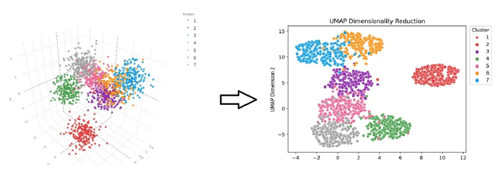
t-Distributed Stochastic Neighbor Embedding (t-SNE, or ‘tee-snee’) is a non-linear technique specifically designed for embedding high-dimensional data into a low-dimensional space, typically two or three dimensions. It’s particularly useful in facilitating insightful visualisations of highly-dimensional data.
Unlike PCA, which is a linear method, t-SNE is good at preserving the local structure of the data and can reveal clusters or patterns that might not be apparent in high-dimensional space.
The key strength of t-SNE lies in its ability to capture the similarity between points: nearby points in the high-dimensional space are likely to remain close in the low-dimensional embedding, while distant points are likely to stay apart.
This makes t-SNE an excellent tool for exploring the intrinsic grouping and structure of complex datasets, such as those found in genomics, image processing, and natural language processing.
By converting similarities between data points into joint probabilities and minimising the divergence between these probabilities in both the high- and low-dimensional spaces, t-SNE provides a visually intuitive representation of the data’s underlying structure.
There’s a useful youtube video here that goes into more detail on t-SNE.
Example
Load the Rtsne library.
Code
library(Rtsne)
Run the model.
code to run t-SNE algorithm
# Set seed for reproducibilityset.seed(42)# Execute t-SNEtsne_result <-Rtsne(data, dims =2, perplexity =30, verbose =TRUE, max_iter =1000)
Performing PCA
Read the 100 x 10 data matrix successfully!
Using no_dims = 2, perplexity = 30.000000, and theta = 0.500000
Computing input similarities...
Building tree...
Done in 0.01 seconds (sparsity = 0.972800)!
Learning embedding...
Iteration 50: error is 51.403660 (50 iterations in 0.01 seconds)
Iteration 100: error is 51.494575 (50 iterations in 0.01 seconds)
Iteration 150: error is 49.920351 (50 iterations in 0.01 seconds)
Iteration 200: error is 50.452859 (50 iterations in 0.01 seconds)
Iteration 250: error is 51.177157 (50 iterations in 0.01 seconds)
Iteration 300: error is 1.505502 (50 iterations in 0.01 seconds)
Iteration 350: error is 1.104699 (50 iterations in 0.01 seconds)
Iteration 400: error is 0.746131 (50 iterations in 0.01 seconds)
Iteration 450: error is 0.344445 (50 iterations in 0.01 seconds)
Iteration 500: error is 0.284487 (50 iterations in 0.01 seconds)
Iteration 550: error is 0.283122 (50 iterations in 0.01 seconds)
Iteration 600: error is 0.289381 (50 iterations in 0.01 seconds)
Iteration 650: error is 0.285725 (50 iterations in 0.01 seconds)
Iteration 700: error is 0.286867 (50 iterations in 0.01 seconds)
Iteration 750: error is 0.287645 (50 iterations in 0.01 seconds)
Iteration 800: error is 0.290331 (50 iterations in 0.01 seconds)
Iteration 850: error is 0.288089 (50 iterations in 0.01 seconds)
Iteration 900: error is 0.288445 (50 iterations in 0.01 seconds)
Iteration 950: error is 0.284590 (50 iterations in 0.01 seconds)
Iteration 1000: error is 0.287327 (50 iterations in 0.01 seconds)
Fitting performed in 0.15 seconds.
code to run t-SNE algorithm
# The output, tsne_result, contains Y which is the embedding in 2 dimensions
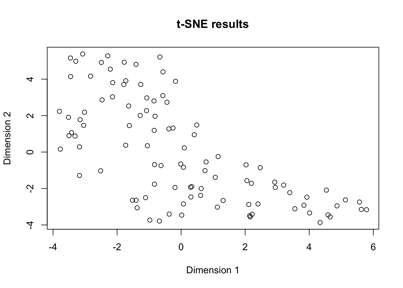
In the scatter plot above, each point represents an observation from the dataset.
Observations that are similar in the high-dimensional space are placed closer together in the two-dimensional space, whereas dissimilar points are placed further apart.
The choice of parameters like perplexity and max_iter can significantly influence the t-SNE results.
Perplexity can be thought of as a ‘guess’ about the number of close neighbors each point has - usually is best within the range of 5 to 50.
The max_iter parameter defines the number of iterations over which the algorithm optimises the embedding.